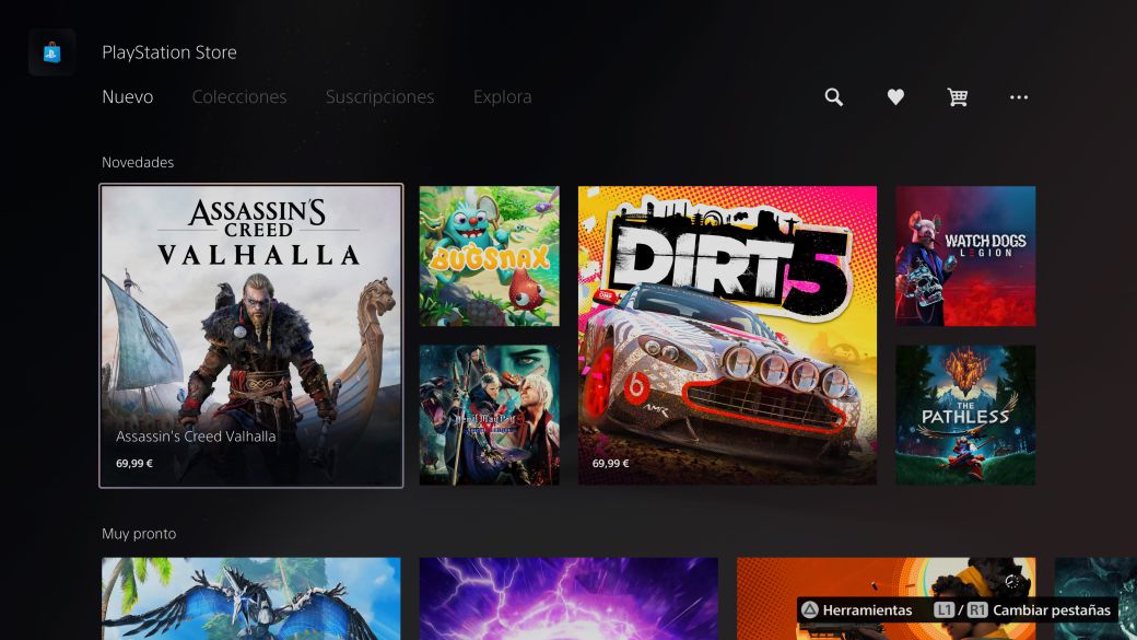
why though, it is a game console; its main purpose is to run games. UI represents all the games on Home Screen in wonderful pictures. Themes seem impossible when the entire screen background changes based on games, icons changing per theme wouldn't be as meaningful as in PS4 also because the game thumbnails fill the entire home. What is left is settings icon at top right and trophy elements perhaps, so as single system wide design sensibility makes much more sense.
You can't change the color of the... Settings area. You're stuck on piss grey, or a darker piss grey if you turn on high contrast settings in accessibility area. Even just changing that to a few PS4 default color choices would help massively. They do give you some color options over in the PS App, mine is "Starlight Blue", but it's still darkened from where I would like it, but my point is PS5 theme-ing isn't even matching what the other PS hand is doing over here.
I actually hate the main PS5 UI, so whilst themes might not make much sense out on the main dashboard right now, I'm not adverse to at least suggesting info/layout rearranges so that they would make more sense.
I can't remember fully, but I believe there was a PS3 UI setting where when we hovered over a game, we only got the game splash art, not the games audio blarring out. They could re-impliment this idea, and add menu background music onto from menu color settings. PS4 never had this, but I always wanted them to split themes and SFX, as so many themes would have naff sound replacements. Selecting all three elements individually would lead to more player console customizability (and thus player ease of access/enjoyment). We're all guilty of getting the odd bit of 360 avatar clothing or a PS3 weed skin or something like that back in the day aren't we?
There's the idea of a nice little OS scattered to the four corners, like if you spend time capturing media or editing it on the console, but even then as an example, I'd perfer the way PS4 trimmed videos. PS5's version feels a hell of a lot more clumsy or inefficient.
Others who go looking at trophy percentages or friends lists on PS5 must be as sick of the grey as I am? C'mon! Half the OS feels like it's for mobile, shoving grey cards in your face like Youtube pop-up boxes. And the other half of the OS is this radically spaced out, floating on grey air text options like searching for a player's name, which feels like I'm navigating some slapass TV screen UI.


